Blog Archives
Day 101: Logs in Life Peer Review
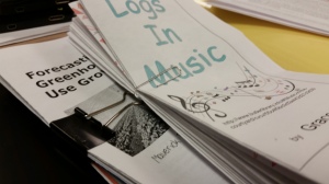
My precalculus students completed a project on logs and logistics function in real world. Before break, they signed up for a topic where logs or logistic functions are used. Students signed up for two possible topics and referenced them with an online site, which they submitted through a Google Form. Since Google Forms are time stamped, I able to use a first come, first served approach to topic assignment. I allowed up to 3 people to select the same topic, but after that, they got their second choice. Out of two classes, I only had 4 students that needed to determine a new topic.
Here is a brief synopsis of what was required:
THE TASK: The end product of your webquest will be a BROCHURE describing what you have learned about your chosen application of logarithms. • Brochure style (tri-folded) • Typed in your own words • Description and history of the application (e.g. “what is a decibel?” and “who invented the Richter scale?”) • Description of mathematics used in calculations – specifically logarithms with an example • Description of at least one career in which this application is used • At least one relevant graphic Citation of other websites used beyond the ones given (just list the url)
Students submitted both a physical copy and an electronic one. I created groups of brochures with different topics and none created by a particular group member.
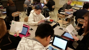
Today they did the peer review of the brochures, again using a Google Form. I used radial buttons for the rubric part of the assessment. There was also a required comment section. I asked students to give both a positive comment about an intellectual aspect of the topic presentation and a constructive criticism. Part of their grade is their review of their peers and their peers’ review of their pamphlet. You could have heard a pin drop.
We had 10 minutes left in class, so I tried something on the fly…never know how that will go. I asked the groups to discuss and determine the most interesting brochure. They then passed that one on to the next group. Maybe this will be part of the whole process next year.
Day 82: Response Bias Project
I just want to thank Josh Wilkerson once again for helping me create meaningful experiences for my AP Statistics students. As I mentioned earlier this year, I am hoping to replicate his Community Service Learning Project as the end of year experience for my students.
One suggestion Josh gave was to give two smaller projects during first semester to see how students work together. I have found that they also give opportunities for the students to revisit previous concepts in a real world setting. In first quarter, my students completed an Infographics Project. In second quarter, I had them complete the Response Bias Project he suggested. And I love the results!!
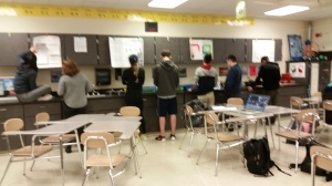
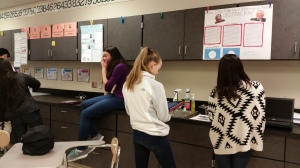
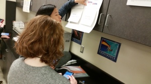
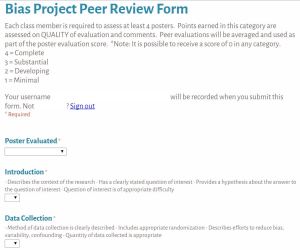
The projects were due today. As part of the evaluation process, students needed to complete a peer review of 4 other projects. I used GoogleForms for students to enter their evaluations as well as include comments. They had about 8 minutes to read through the poster and evaluate it. I thought they’d need 10 minutes, but they didn’t
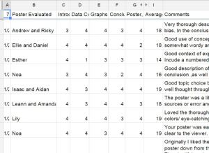
What I like about the Google Form is it is easy to make accessible to my students, by using our school login I get an automatic signature and the students can keep resubmitting the form. In addition, the results end up in an Excel spreadsheet so I can then add up the totals, sort by student being evaluated as well as those who did the evaluating.
Student earned points from the average of their peers’ evaluations as well as points for thoughtful and meaningful evaluations of their peers. I now hope to merge the comments into a personalized Word document so each student can get their peers’ feedback anonymously. Here are a few of the peer comments:
- Originally I liked the idea of flaps but as soon as I had to reach on my tippy toes to hold the flap up I grew tired of it. Then I took the poster down from the wall and I liked the design again.
The plentiful analysis in the conclusions is good and clear. I’m surprised 20 males said they didn’t support feminism, especially since we’re talking about XXHS students! - I like how you chose a topic extremely relevant to all of us. You did a good job explaining the difference in the questions and why that would elicit different responses. Don’t forget your table! Do you think underclassmen would give different results? I might interview them too in order to remove bias.
- I thought the experiment was very well thought out and thorough. You lovely duo did a great job articulating your points. Maybe in the future you should experiment with whether putting one of the names first affects the results? I might also put less text and more visual stuff on the poster. Great job though
- I feel like the questions are a little vague, as they could present a large amount of bias. Some students might not like the teachers, even though they are learning a lot and they are satisfied with the learning, prompting more “no” answers than should be present. However, I love the organization of this poster, it is very neat.
- I like how you captured an interesting concept (extra information bias) very simply. But, given that your population is American Women, I think it is statistically incorrect that you only found samples from XXXXX’s Facebook contacts who do not represent all American women. A better population would have been Teenage girls in XXXXXXXXX.
I love how my students used the statistical vocabulary with ease and relatively correctly! This project is definitely a keeper.
Day 26: Who Pilfered My M&Ms?
This is a perennially fun day in AP Statistics. The problem the students are given is:
In her desk in the math department, Ms. A. keeps a large jar full of m&m’s for use in her Statistics classes. Over the past few days, several m&m’s have gone missing. Eager to catch the culprit, Ms. A notes that the only people who have access to her desk are the other math teachers at the school. Ms. A sends out an email asking whether or not her colleagues have been making unauthorized withdrawals from the jar, but no one confesses to the crime.
The next day, Ms. A catches a break–she finds a clear handprint on the cookie jar (unfortunately for our suspect, that whole “melts in your mouth, not in your hand” thing isn’t really accurate). Ms. A is calling on you, the AP Statisticians, to help identify the prime suspect in “The Case of the Missing m&m’s.”
There are 10 individuals of varying heights in the math department–we’ll also consider our principal in this investigation. To identify the prime suspect, we must determine the relationship between handspan and height.
This problem was adapted from Jason Molesky’s activity at StatMonkey. Students collect data, create a scatterplot of the class data, determine the LSRL and use it to predict the height of the culprit based on handspan. Lots of great discussion during the period.
Day 9: Bad Graph, Good Graph
I found this idea created by Jeffery Kent called Misleading-Graphical-Displays-Project. (Jeffery, if you happen to read this post, please share your website so others can experience your wonderful activities). Jeffery even has a rubric to go along with the project!! Here is a copy of my version and I kept the same rubric.
In a nutshell, the project asks students to find a misleading graph and make a copy. Then they write an analysis of the graphical representation and, at a minimum, answer the following questions about it:
- What do you think makes the representation misleading? (For example, does the scale start somewhere other than zero or are the scales misleading?)
- What do you think was the creator’s purpose in creating the display in a misleading manner? (For example, do you think the creator was trying to make consumers think a project was better than it was? Do you think the author was trying to emphasize a point?)
- What could the creator have done to make the representation fair and non-misleading?
One change I made to the project was to require the students to create a new graphical display that fairly represents the data being displayed. In addition to the “fair” representation, I asked them to create a graphical representation of the data that is misleading in the opposite direction.
Today, my students were so excited about their posters that they wanted to present them (without it even being required!). So I had them share in their groups, and then post all of them outside my room in the hall. Great PR for AP Stats and they have an authentic audience.
My kiddos gave the mini-project a “two thumbs up” and said they really had fun with it. Here are a couple examples of their awesome work. Now I am just as excited to assess them.
I was so happy with the success of this project. What project have you tried that turned out to be a “keeper?”
Day 171: Infographics Project Starting
I am soooooo excited. Today my AP Stats students start their end-of-year project. I just love to see how everything comes together for them. Every year I try a new medium in which they complete the project and as I posted earlier, this year students will present their results in an infographic.
I spent some time with a social studies colleague of mine who did infographics with her freshman. She shared some best practices she gained when doing the project with her students. One of the key shares was that she had her students use Piktochart as the free medium for actually creating the infographic.

It is easy to use, entering or importing data is easy, there are pre-made templates and once the infographic is complete, it can be made into a slideshow presentation so my students don’t need to create a powerpoint to present their findings.
As part of the set-up I had two basic guidelines:
Ask and Answer an Intellectually Interesting Question
For the first part of your application project, your pair will describe a particular problem that can be addressed through the primary statistical techniques we are studying this year—namely, confidence intervals and hypothesis testing, and linear regression.
- Determine an intellectually Interesting Question and at least 5 supporting questions
- Identify the population of interest, needed sample size, etc.
- Design an unbiased survey/method to collect data that answers your question
- Collect the data (you will hand in the raw data collected)
- Analyze question using statistical inference
And then:
Creating the Infographic
You should use appropriate data visualizations and other visual elements (colors, shapes, lines, typography, whitespace, and so on) in ways that enhance your infographic’s potential for communicating your work on the project. Your infographic can be any size or shape, but it must be of sufficient resolution to display well on the course blog. Your infographic should be designed so as to make sense to a fellow student in an AP Statistics course. Thus, you may assume that your audience is familiar with the material we have covered together as a class this year.
- Keep in mind that the central idea of the study should be prominent feature of the poster.
- Infographic Title should be informative
- Use statistical principles studied in this course: data displays, numerical analysis, inference and decisions (interpret p-value)
- Reveal data at several levels of detail, from a broad overview (at a distance) to the fine structure (closer inspection reveals more intricate information).
- Use supporting questions to guide how to display various aspects of your data to convince audience
- Graphic’s legend should clearly match to the graph
- Results of inference for main question as culminating evidence: connects statistical results to the context of the problem.
- Harmonious and strategic use of color and design elements. No trivial or extraneous information, etc.
I am using to collect information from the students about their partner choices, their main and supporting questions, hypotheses, data collection methods, etc. More to come in the following days!

Day 151: Traffic Flow Problems
As our final application of augmented matrices, we tackled the area of traffic flow solutions. We kept it simple using one way streets and only 3-6 intersections. We did discuss that these problems require computers to handle cities with 100s or 1000s of intersections, but we were using a simplified situation to understand the underlying constructs of the situation. The simple diagram we used is:
Here was our introduction problem situation:
The figure shows the intersections of four one-way streets. As you study the figure, notice that 300 cars per hour want to enter intersection I1 from the north on 27th Avenue. Also, 200 cars per hour want to head east from intersection I2 on Palm Drive. The letters w, x, y, and z stand for the number of cars passing between the intersections.
-
If the traffic is to keep moving, at each intersection the number of cars entering per hour must equal the number of cars leaving per hour. Use this idea to set up a system of linear equations involving w, x, y, and z.
-
Write the related augmented matrix. Use your calculator to solve the equation – but be sure to understand how to use row operations to solve as well.
-
If construction on 27th Avenue limits z to 50 cars per hour, how many cars per hour must pass between the other intersections to keep traffic flowing?
Once again, my students were fascinated and interested in another way matrices can be used in real situations.
Day 148: Determinants to Find Area, Really?!
Today we looked at how determinants of matrices can actually be of use beyond solving matrix equations. One interesting application is using the determinant of 3 points to find the area of any coordinatized triangle. You can see the two examples we did to use the formula . It was a great way to review the process of finding the determinant of a 3×3 matrix.

However, my students wanted to know WHY this process worked. I was so thrilled with their question and so I gave them a couple of days to think about the “why” of the method. After a night of thinking, we began to explore the problem. I simply scribed for the class as they thought through the relationship. It is a nice way to connect geometry and algebra in an interesting and unexpected way!
Day 104: Thinking About the Future
How do I make Precalculus relevant to my high school students? We study the mathematics of finance! In particular, we use the Present Value and Future Value formulas for situations that are meaningful to teenagers who are looking forward to becoming independent. In comes the Partner Finance Activity.
Students are introduced to the scenario: You have just graduated from college and managed to land a job (hopefully using the degree you just earned.) You are ready to buy your first dream house or condo. I have the students use the randint( function on their Nspires to determine the range of house values they qualify for. Then they define some terms such as FICO score, points, and ARM. Then they use the internet to search for a home that fits their range. 

Once they have a house chosen, they determine the type of loan and calculate their monthly payment. 
